For the right days.And for the others.
Website for Dies Certus, an insurance agency in Oliveira de Azeméis, Portugal. Dies Certus means “the right day”; the site speaks of the right days and of the others, the ones nobody plans. Live since 30 October 2026.
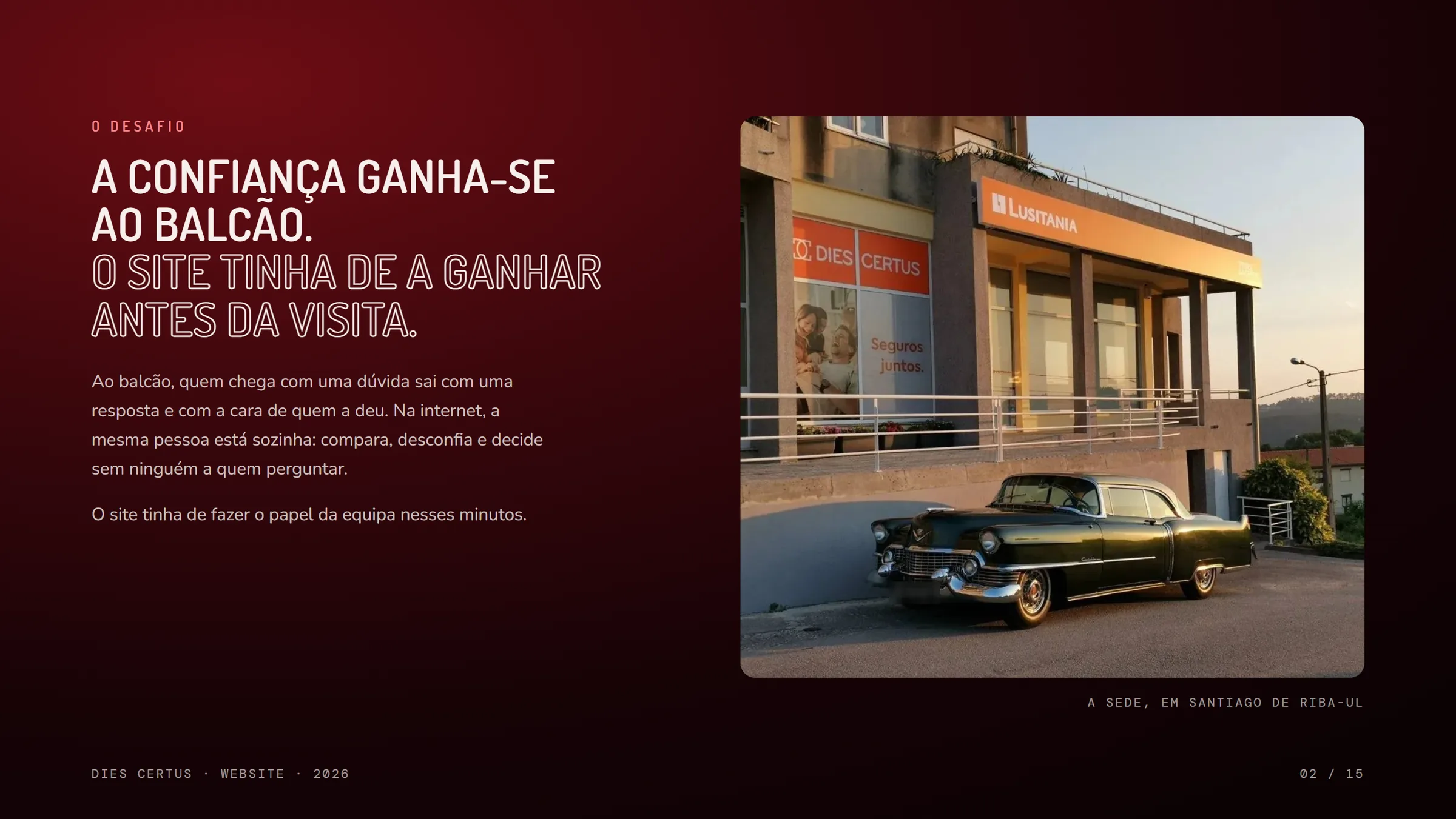
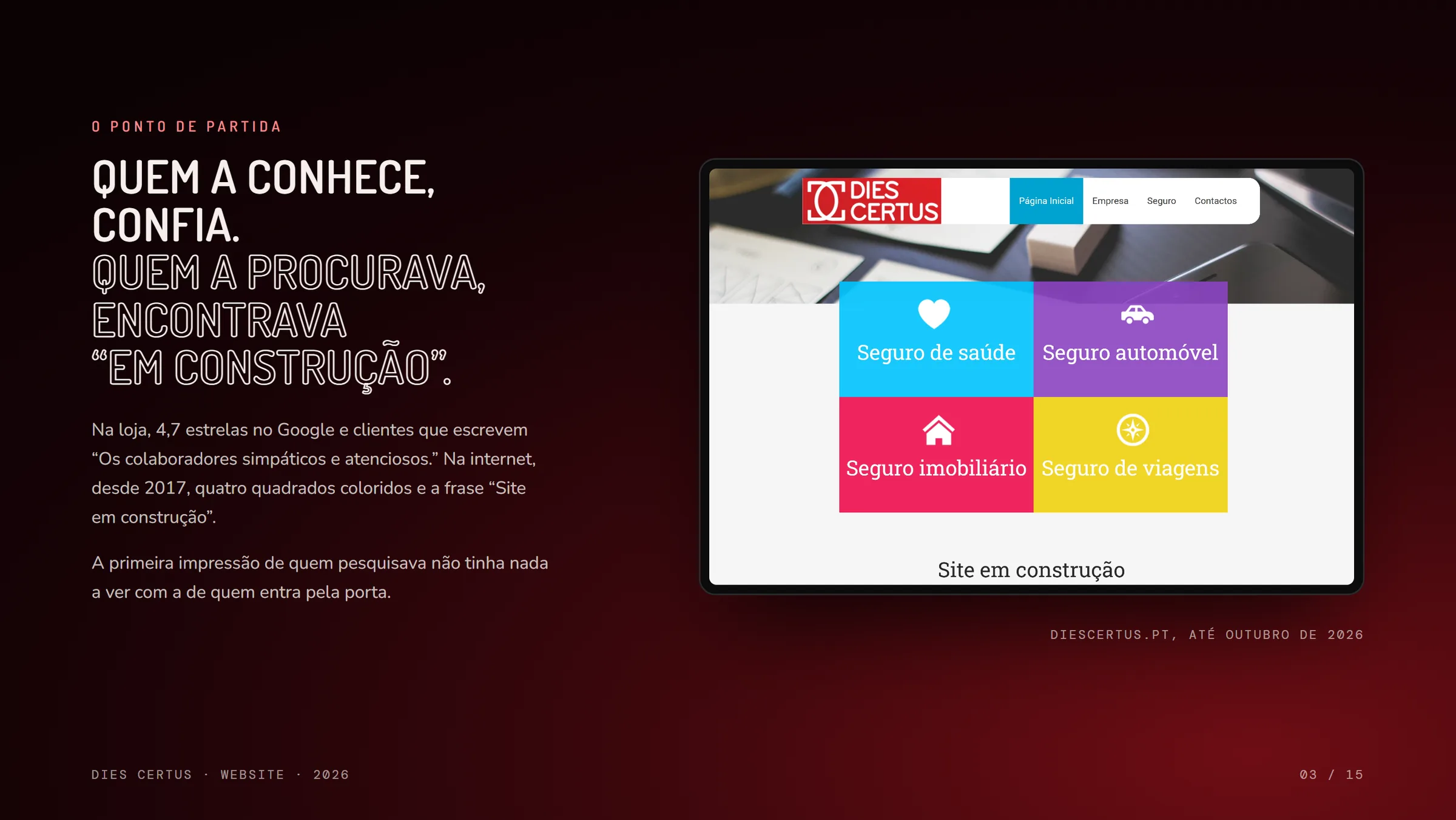
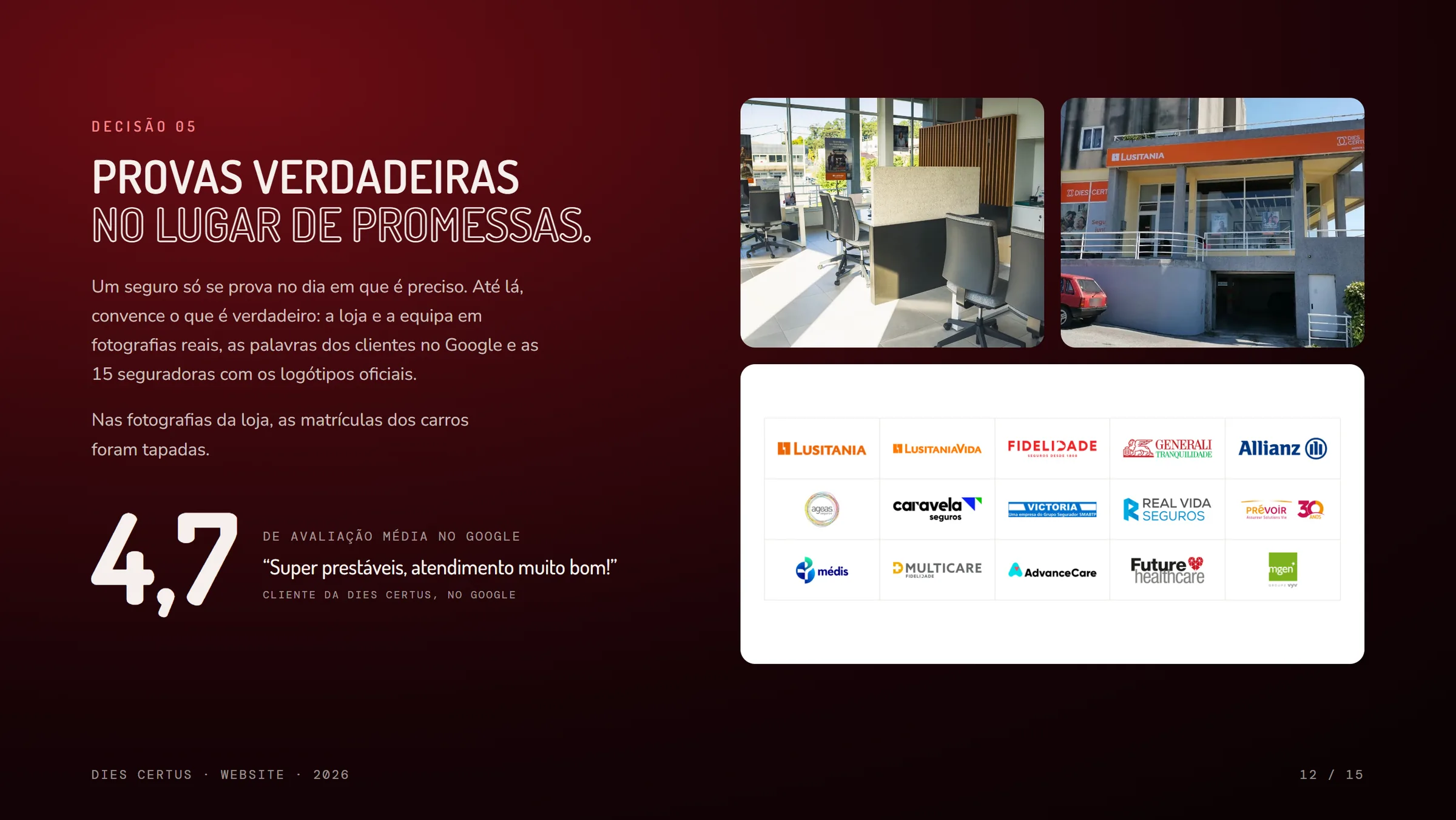
Visit the websiteDies Certus began in 2006 and has been a company since 2010, with its head office in Santiago de Riba-Ul and a second office in Nogueira do Cravo, in Oliveira de Azeméis, Portugal. It works with 15 insurers and has clients across the country and abroad. In the shop, the trust is plain to see: 4.7 stars on Google and customers who write about friendly, attentive staff. Online, since 2017, there was only a page saying “under construction”.
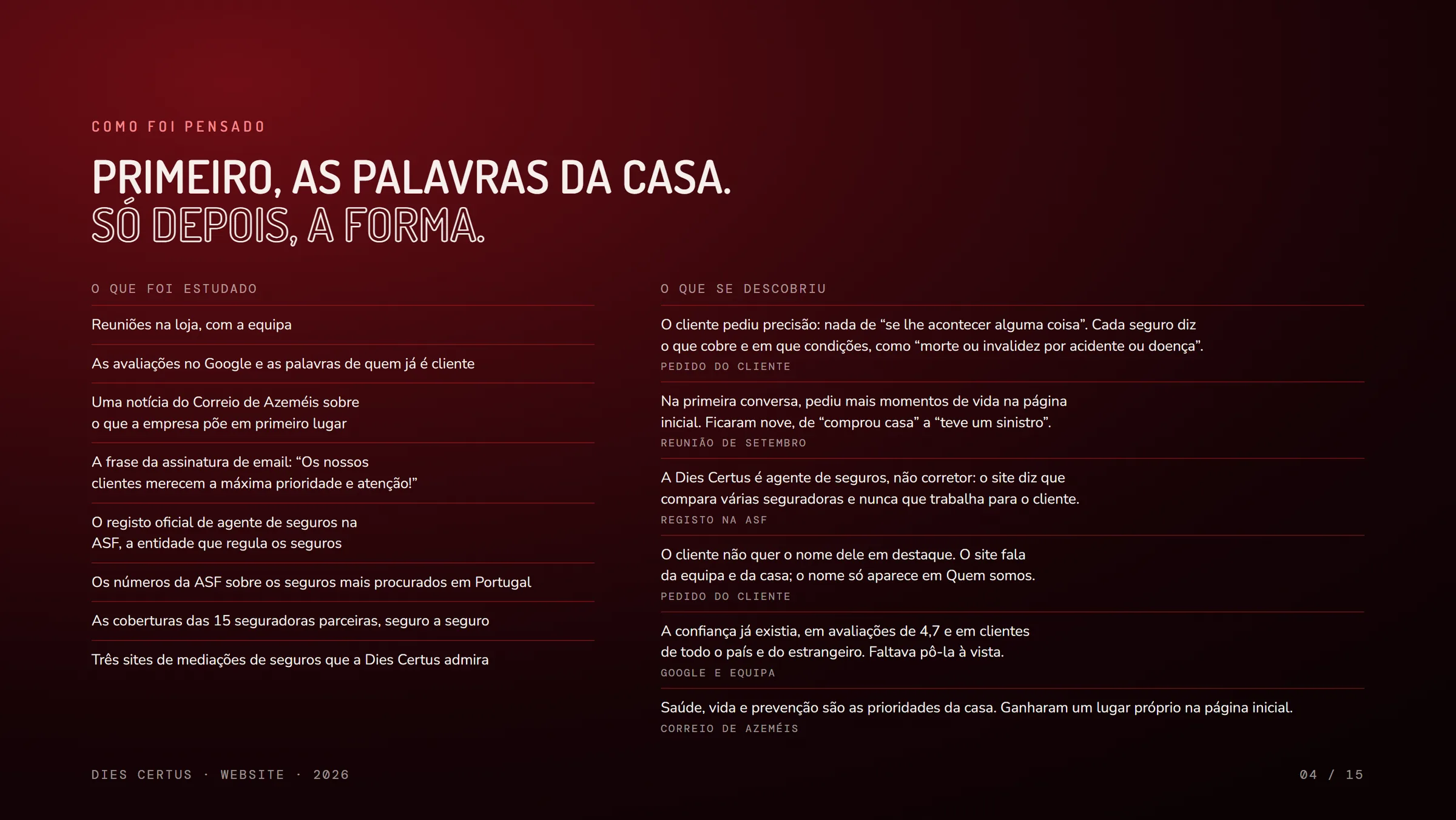
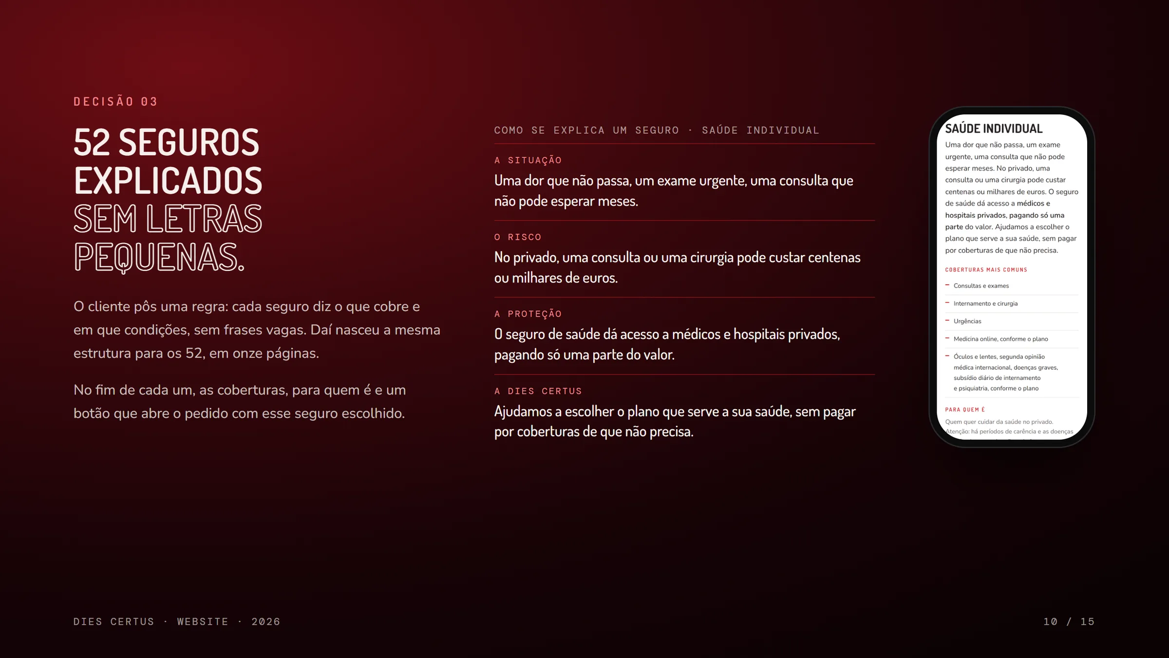
Before any design, the study started at the shop, with the team, and went through customer reviews, a local newspaper article, the official registration as an insurance agent and the cover offered by each of the 15 insurers. From those conversations came the rule behind the whole site, set by the client himself: no vague phrases like “if anything happens to you”. Every product says exactly what it covers and under which conditions.
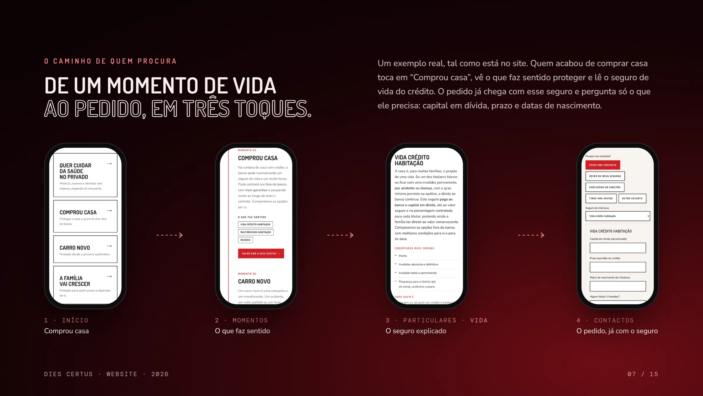
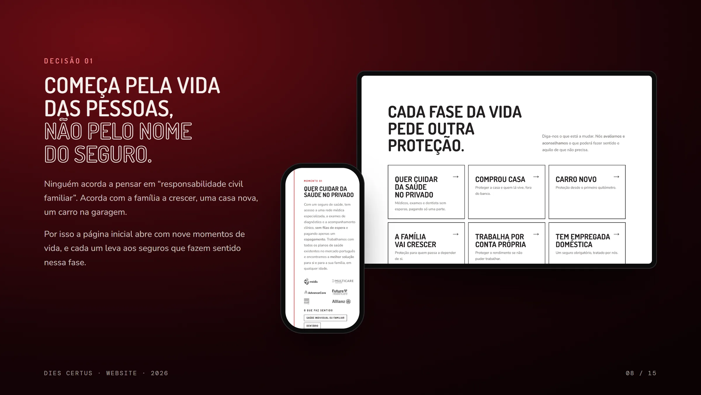
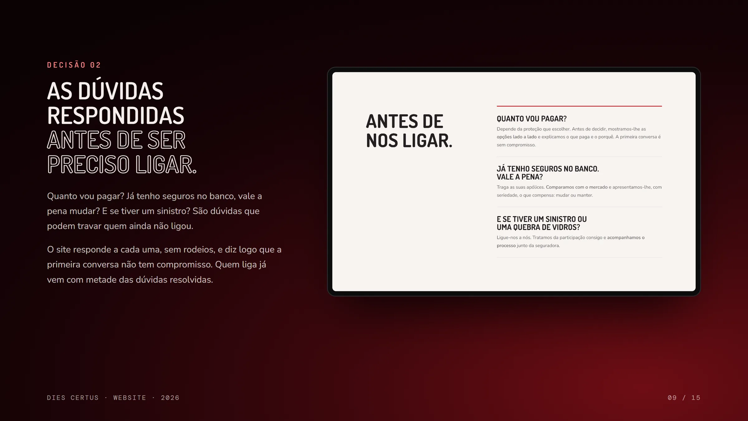
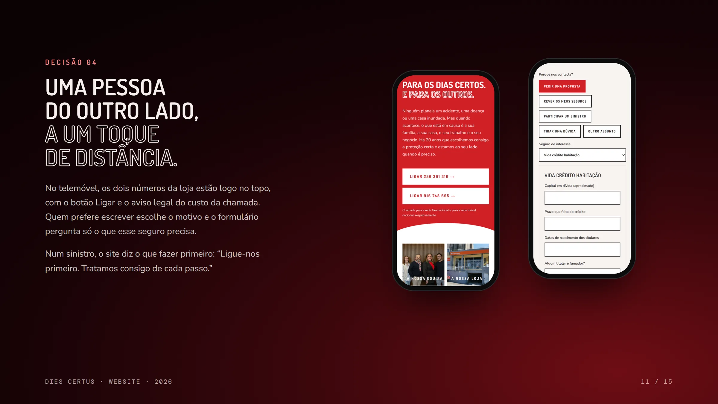
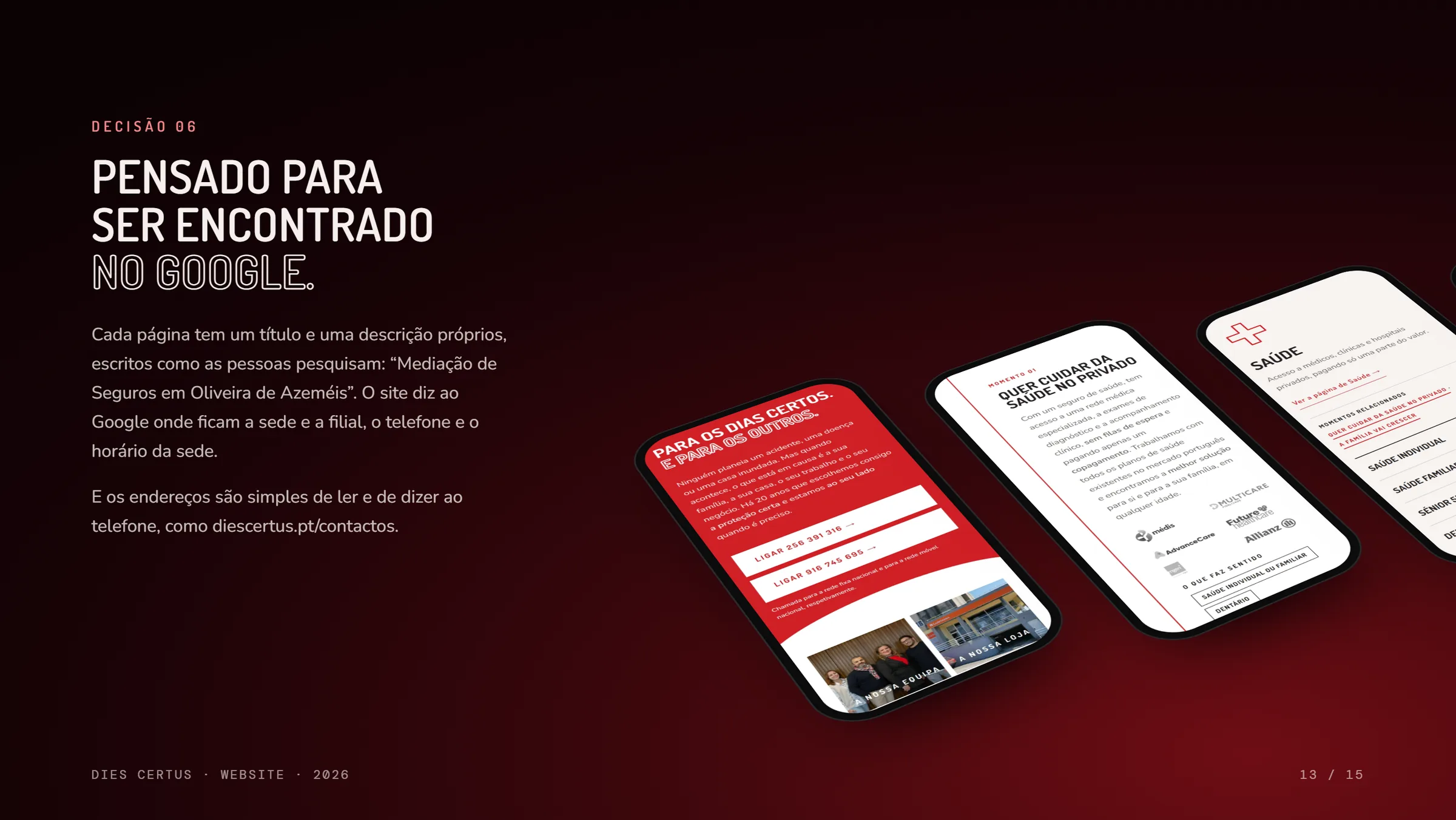
The new site starts with people’s lives, with nine life moments, from “bought a house” to “had a claim”, and explains 52 insurance products always in the same way: the situation, the risk, the protection and how Dies Certus helps. It answers common questions before the call, keeps both phone numbers at the top of the mobile screen and shows only real proof. For people who don’t know the agency yet, the first impression now matches the one you get walking through the door.
- Client
- Dies Certus – Mediação de Seguros, Lda.
- Sector
- Insurance agency
- Location
- Santiago de Riba-Ul, Oliveira de Azeméis, Portugal
- Scope
- Research, site structure, copy, design, development and search optimisation
- Pages
- 6 main pages, 11 insurance areas and a legal page
- Live since
- 30 October 2026
- Photos
- Rofi Studio, Dies Certus and Unsplash
Want a website built this way?
Let’s talk
The first conversation comes with no obligation.
[email protected]