A studiowith a person’s name.
The brand for Rofi Studio, Renata Sofia’s creative studio: a pen nib inside the O, drawn by hand, and a brand guide that explains the reason behind every rule.
Rofi Studio is Renata Sofia’s creative studio in Oliveira de Azeméis, Portugal. The name comes from Renata Sofia: a short first name that is easy to say in any language. The brand had to serve the studio’s four areas, brand, imagery, space and digital, and keep its drawing at any scale, from a 24 px icon to a poster.
The brand rests on an essence written by the founder: the purpose of drawing, expressing and giving form to what lives at the essence of each person, project or business, and six values, creativity, closeness, freedom, care, rigour and quality. The voice is that of a person, not an agency.
- Client
- Rofi Studio
- Location
- Oliveira de Azeméis, Portugal
- Scope
- Strategy, identity, brand guide and website
- Logo
- Drawn by hand by Renata Sofia
- Year
- 2026
- Photography
- Jaime Marrero, Unsplash
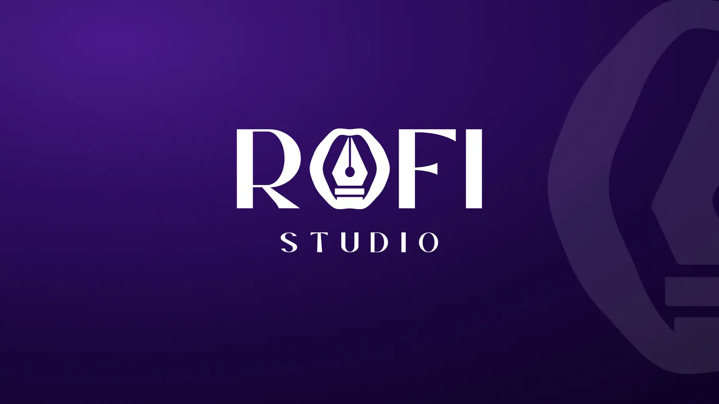
One brand, from icon to poster.
The brand had to serve the studio’s four areas, brand, imagery, space and digital, and keep its drawing at any scale. That is why there are three versions of a single logo: the main logo from 120 px, the name from 80 px and the symbol from 24 px.
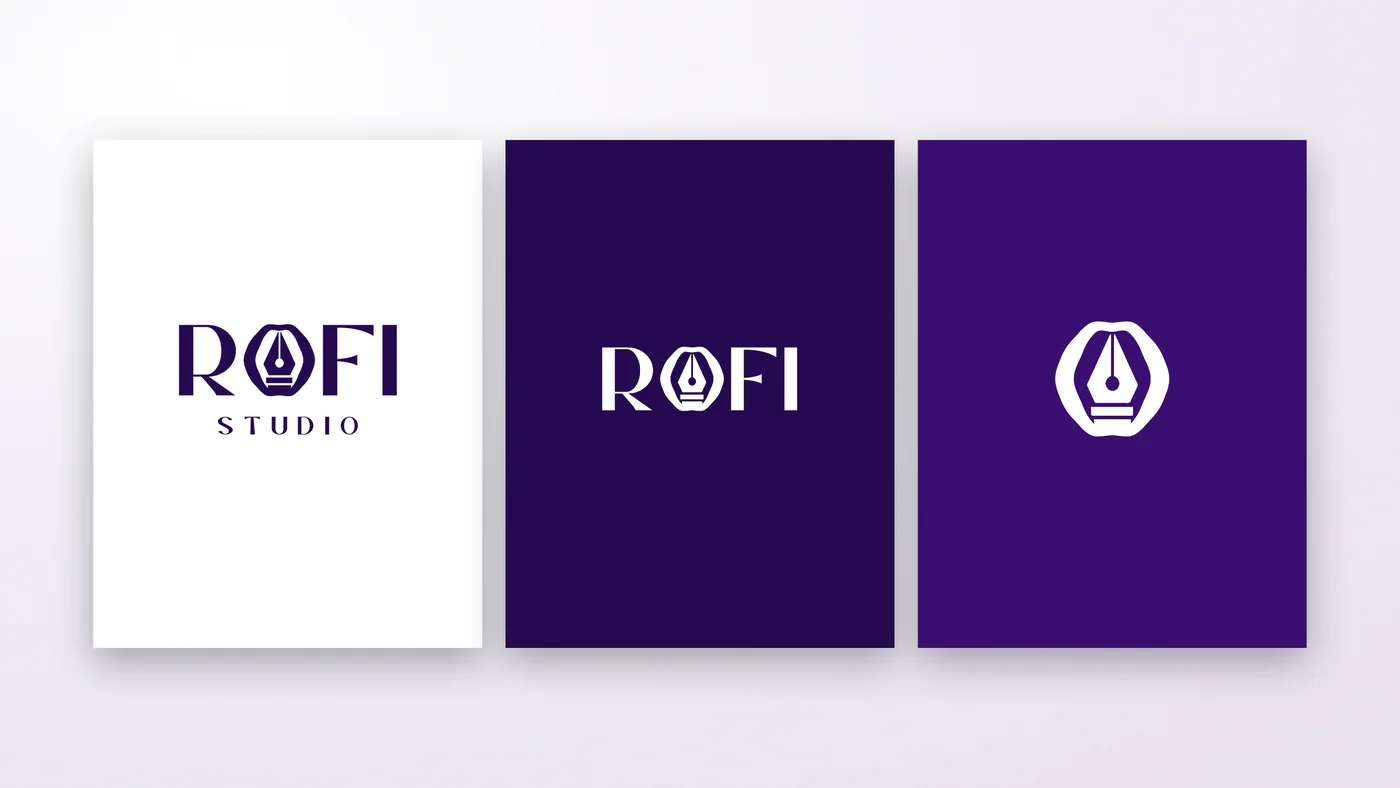
A pen nib inside the O.
The O in ROFI is also the symbol: the name and the idea are read at the same time. The nib is a reminder that every project starts on paper; the wavy outline, drawn by hand, wraps around it like a wax seal, the mark of someone who signs their work.

It draws itself the way you write.
In the animation, the outline draws itself first, the nib follows and the name closes the sequence, with no bounce and a still ending.
The violet of prestige and three typefaces with three jobs.
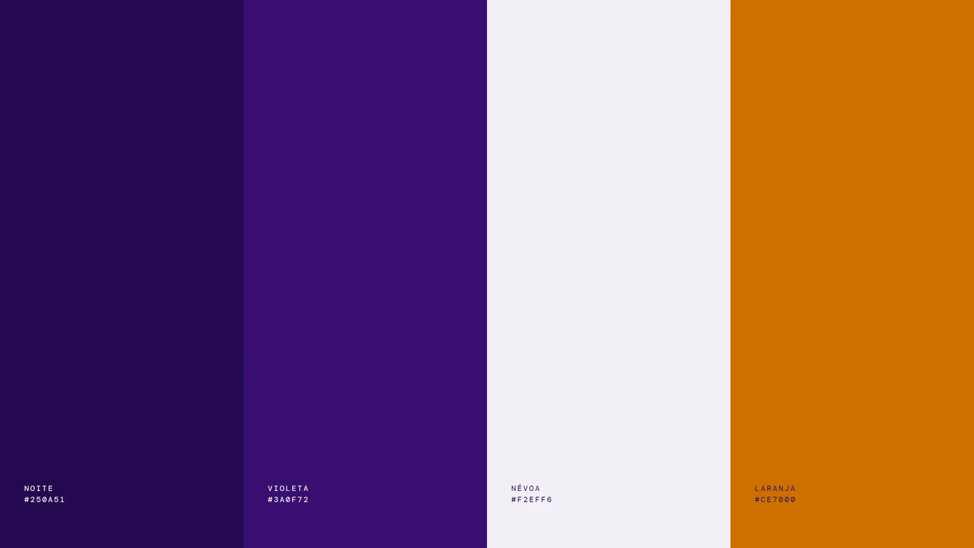
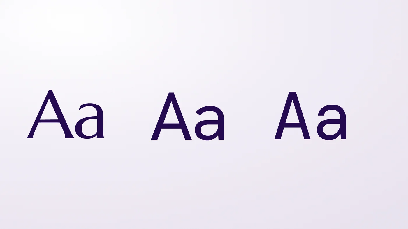
Violet stands for status, creativity and genius; Night leads and orange, used sparingly, guides the eye. Marcellus has strokes that flare at the ends, like the letters of the logo, Hanken Grotesk keeps reading restful and DM Mono lines up dates, prices and measurements.
Every rule with its reason.
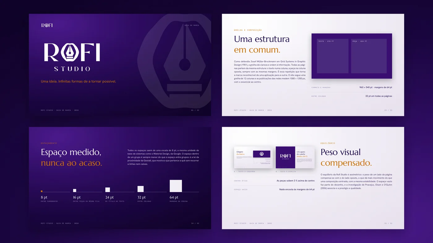
The brand guide brings together the identity, the visual system and its application in 33 pages, and explains every rule: Müller-Brockmann’s grid, the 1.25 type scale, the law of proximity and WCAG contrast.
On the website, the same voice and the same type.
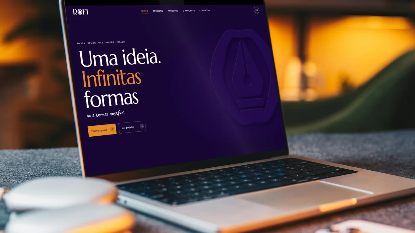
On rofistudios.com, in Portuguese and English, the symbol opens the page and every enquiry reaches the founder.
One idea. Endless ways to make it possible.
Every brand starts by understanding the business and the people it serves. Only then is it designed.

Want a brand built this way?
Let’s talk
The first conversation comes with no obligation.
[email protected]